Do you want to make your website mobile-friendly? If you are looking for a step-by-step guide, keep reading this article. Here, I will show you the best seven tips to get a responsive design in WordPress!
Starting a mobile-friendly website or an online store with WordPress is simple. Even if you are a beginner or non-tech-savvy professional, you can make it because you don’t need to deal with the coding part.
Once you have optimized your site for mobile users, I’m sure you will have the potential to make massive conversions. Since most users prefer mobile phones to browse the internet, optimizing your website and making it mobile-friendly is mandatory.
Keep reading this article if you need to learn how to do it. Here, I will teach you what’s a responsive design, why you need to make a mobile-friendly website, how to make a mobile-friendly website, and also answer some of the frequently asked questions.
What is Responsive Design?
Responsive design is a common term used by web developers and WordPress theme developers. The idea is simple – if you have purchased a responsive theme, it will fit evenly on every screen size.
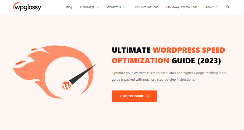
You do not need to add extra code to the theme to improve it on a specific screen size. For example, my blog, WPGlossy, uses a responsive theme. Here’s how it looks on a desktop:
On a mobile phone, it displays like this!
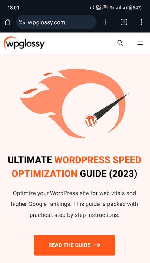
As you can see, there are no issues with the blog, and the theme works very well with the screenThat’s That’s the meaning of responsive design. Next, let’s see what is a mobile-friendly website.
What is a Mobile-Friendly Website?
As the name implies, a mobile-friendly website provides the best user experience for mobile visitors. The web pages adapt to any screen size and contain touch-friendly elements. It loads super fast as well!
So, how do you optimize your website for mobile devicCheckheck out the next section!
How to Make a Website Mobile-Friendly?
To make a mobile-friendly website, use these tips:
- Adjust graphic elements
- Use a responsive theme
- Use a dedicated mobile-friendly plugin
- Use Google’s AMP
- Check the opt-in forms
- Add custom width and height to embeds.
- Optimize the images
These tips let you build a mobile-friendly website. Without any further ado, let’s get into the tutorial.
1. Adjust Graphic Elements
The first thing you should do is ensure the graphic elements are well-arranged. When you run a website or online store, you might use social media icons or icon SVGs to keep the website beautiful. Keeping enough space in between the icons is a good choice.
You can also work on the typography to ensure the website will provide the best user experience. Besides the optimizations I mentioned earlier, you should also focus on the spacing of the vector graphics. Once you have implemented this tip, move to the next step.
2. Use a Responsive Theme
Next, you need to focus on the WordPress theme you are using. These days, most WordPress themes are responsive. You can pick one according to your requirements and start customizing the website.
If you are unsure about the theme’s responsiveness, check out the demo website provided by the theme developer. While going with the custom-built theme, confirm the responsiveness of the templates with the developer.
According to my view, the best responsive themes in the market are:
- GeneratePress
- Astra
- Kadence
- Divi
To create custom page designs with high personalization, combine the theme with a well-known page builder plugin like Elementor or Divi Builder! They contain drag & drop elements, and hence, you don’t need to worry about design freedom and comfortability.
3. Optimize the Images
If you are running a tutorial website or a blog that needs images to convey the message better, you should take a step further and optimize the images. You can find fphotosages online or create your own using editing software such as Adobe Illustrator.
By default, people will upload images directly to the media library and embed them in posts, pages, etc. It is a bad practice. Compress the images and enable lazy loading to improve the image serving.
Here are the plugins to enable automatic compression, check out:
On the other hand, if you prefer an online tool to compress the images without losing quality, check out:
Most WordPress caching plugins come with the lazy load feature. So, use any cache plugin to cover this part.
Besides, when you embed images to your posts or pages, you can choose a custom size too.
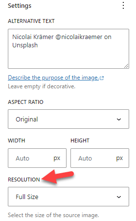
You can choose one of the pre-made image sizes from the dropdown or enter a custom height and width. After modifying the image settings, publish (or update) the post.
4. Use a Mobile Friendly Plugin
The next option I have for you is to use a dedicated mobile-friendly plugin. Several plugins are available to optimize your website for mobile phones.
Some of the best ones are:
Configuring these plugins is relatively easy. Once you have installed and activated the tool, you can start customizing the mobile version of your website.
5. Use AMP
AMP stands for Accelerated Mobile Pages. It is a feature released by Google to help mobile versions of the website get more traffic by boosting the page load time and ranking. If you have a decent amount of mobile visitors, I recommend implementing AMP.
Setting up AMP is easy. You can use the AMP for WP plugin to integrate Accelerated Mobile Pages into your WordPress website. Then, test your web pages using this tool. This way, if there are any errors, you can find and solve them.
6. Check your Opt-in Forms
Studies show that more than 90% of website visitors will never return. As a blogger or business owner, this is hurtful. Integrating lead generation or push notifications is the best way to protect your online business from this issue.
While adding opt-in forms to capture your website visitor’s email address, ensure the form itself and the images added fit nicely on mobile screens. If the pop-up form is not optimized for mobile phones, it will frustrate your mobile users, and they never come back.
So, check out the responsiveness of the opt-in forms. Most lead generation plugins like OptinMonster, Bloom, and Thrive Architect offer responsive lead generation forms. If you prefer, you can also add custom CSS code to ensure the form’s responsiveness.
7. Add Custom Width and Height to Embeds
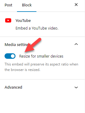
If you embed YouTube videos on your website, recheck the configuration options. Check the right-hand side if you use the YouTube embed block to embed videos.
Enable the option called Resize for smaller devices.
You can also find the CSS class of the block from the Advanced tab.
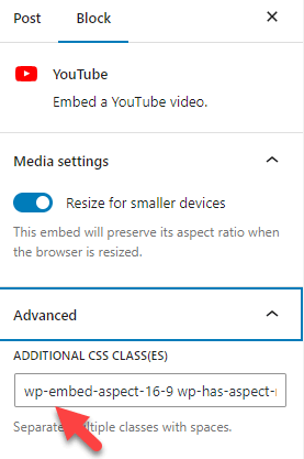
Use this class to add custom CSS code (for example, a max height and width). This way, you can add custom width and height to eThat’s That’s it!
Following these steps will help you create an ideal mobile-friendly WordPress website.
Frequently Asked Questions
Now, let’s see a few FAQs regarding the mobile-friendly website and why you need one!
Does WordPress Have a Mobile-Friendly Design?
WordPress is a CMS (Content Management System). Mainly, the theme you use on your website determines if your website is mobile-friendly or not.
Is There Any Responsive Themes Available?
Most themes available in the WordPress themes repository and marketplaces like ThemeForest are responsive. If you have any issues with the theme, don’t hesitate to contact the official support team; they will help you solve the responsiveness issues.
How Does Google AMP Help Mobile Users?
Once you have implemented AMP, your website will rank better on mobile searches. Since the design is also minimal, the loading speed of the pages will be best. AMP is a good choice if you are targeting, especially mobile visitors.
How Can You Make Sure Your Website Is Mobile-Friendly
You may use Google’s Mobile-Friendly test tool to check for issues. It is a free tool; they will tell you if your website has mobile-friendliness issues.
Conclusion
Since most people use mobile phones to check the internet, it is recommended to have a website that is optimized for mobile phones. Moreover, having a responsive design in WordPress will help you get top Google rankings.
There are multiple ways to ensure the website is mobile-friendly. In this post, I have shown you seven custom methods to make your WordPress website mobile-friendly. All the methods mentioned here are beginner-friendly and don’t need coding knowledge.
Have a look at them and start implementing them one by one. You can easily optimize your existing WordPress website or WooCommerce store for mobiles. Do you know any other methods to make the website responsive? Let me know in the comments.
This blog post provides a comprehensive and actionable guide to implementing responsive design in WordPress, ensuring that your website seamlessly adapts to different screen sizes and provides an optimal user experience across all devices. The author clearly explains the importance of responsive design and outlines seven practical tips to achieve a mobile-friendly website.